Bloom
Wabi Sabi
Shiroiya Hotel
Sparse Chaos
Designboom
Stepstop
( In progress)Renascence
ARIMA ART SANPO
( In progress)XI XIANG
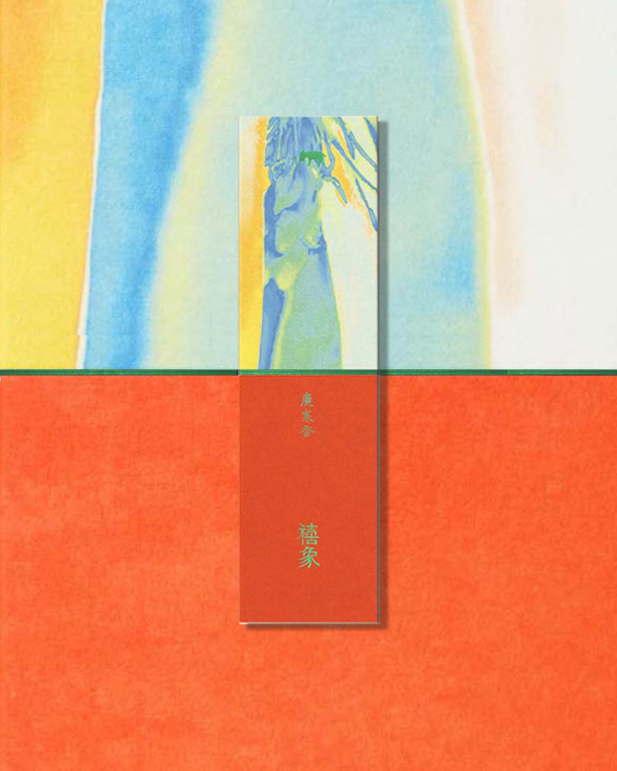

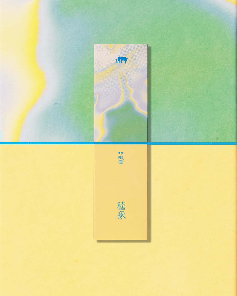
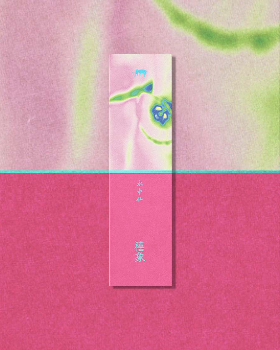
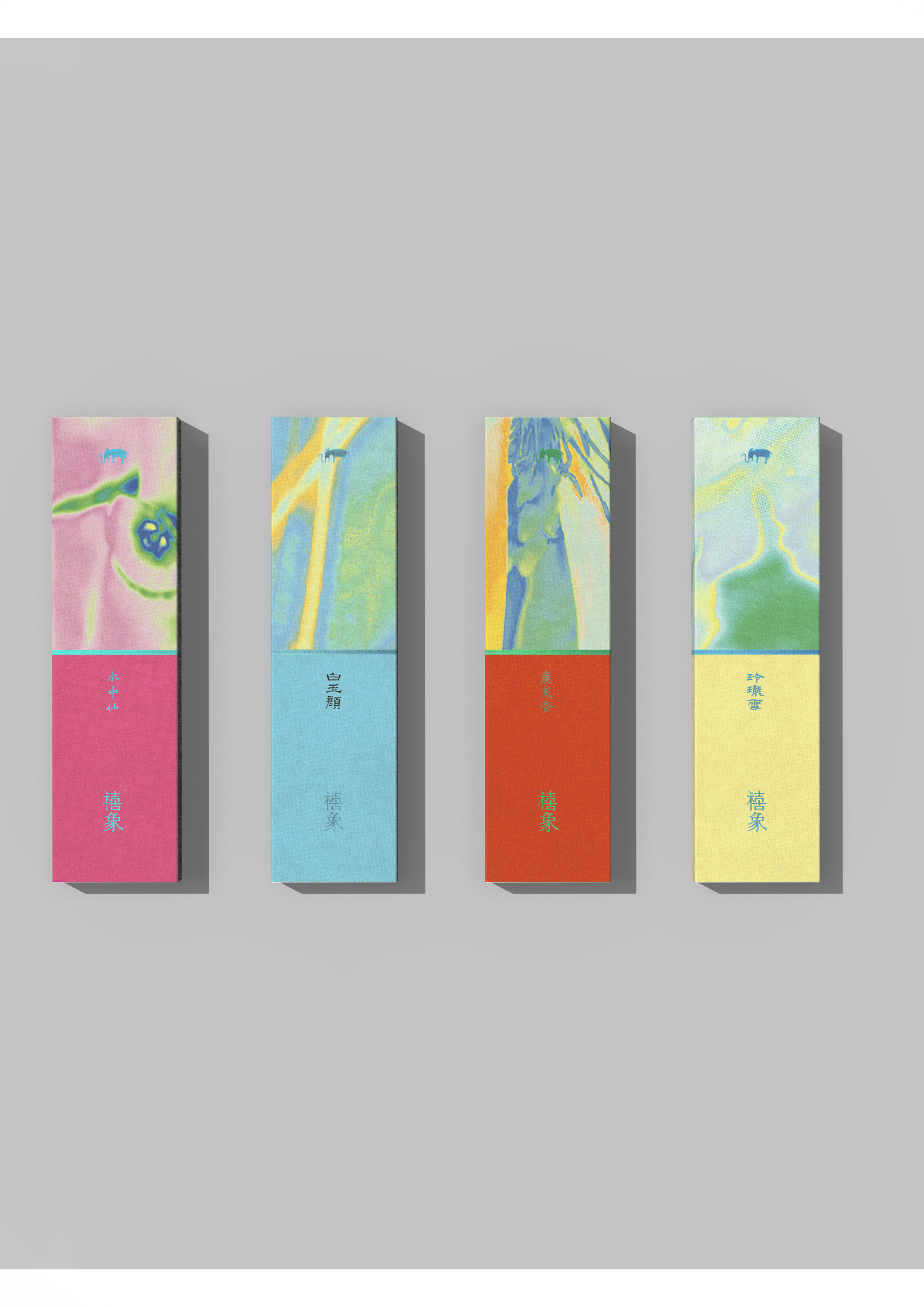
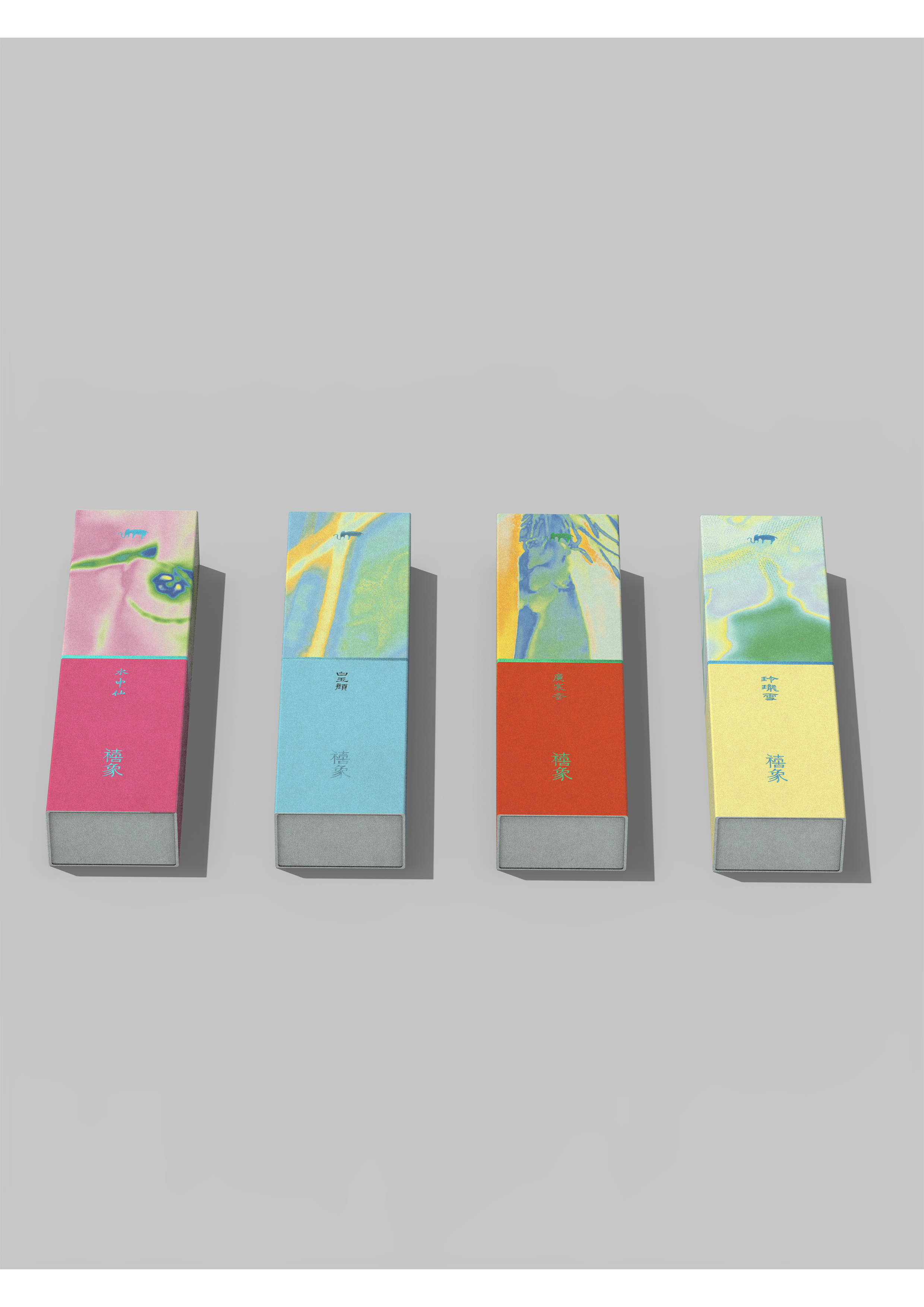
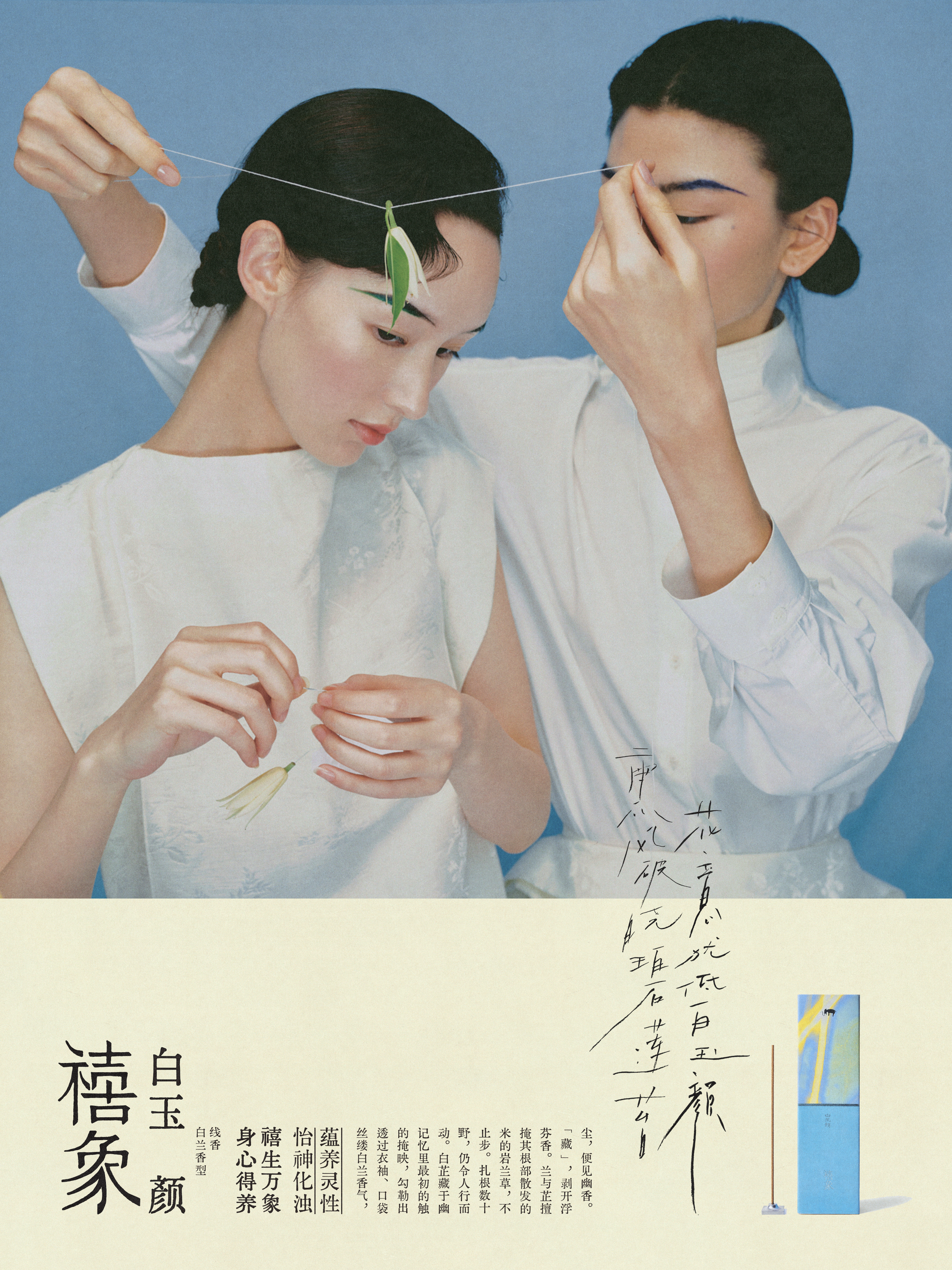
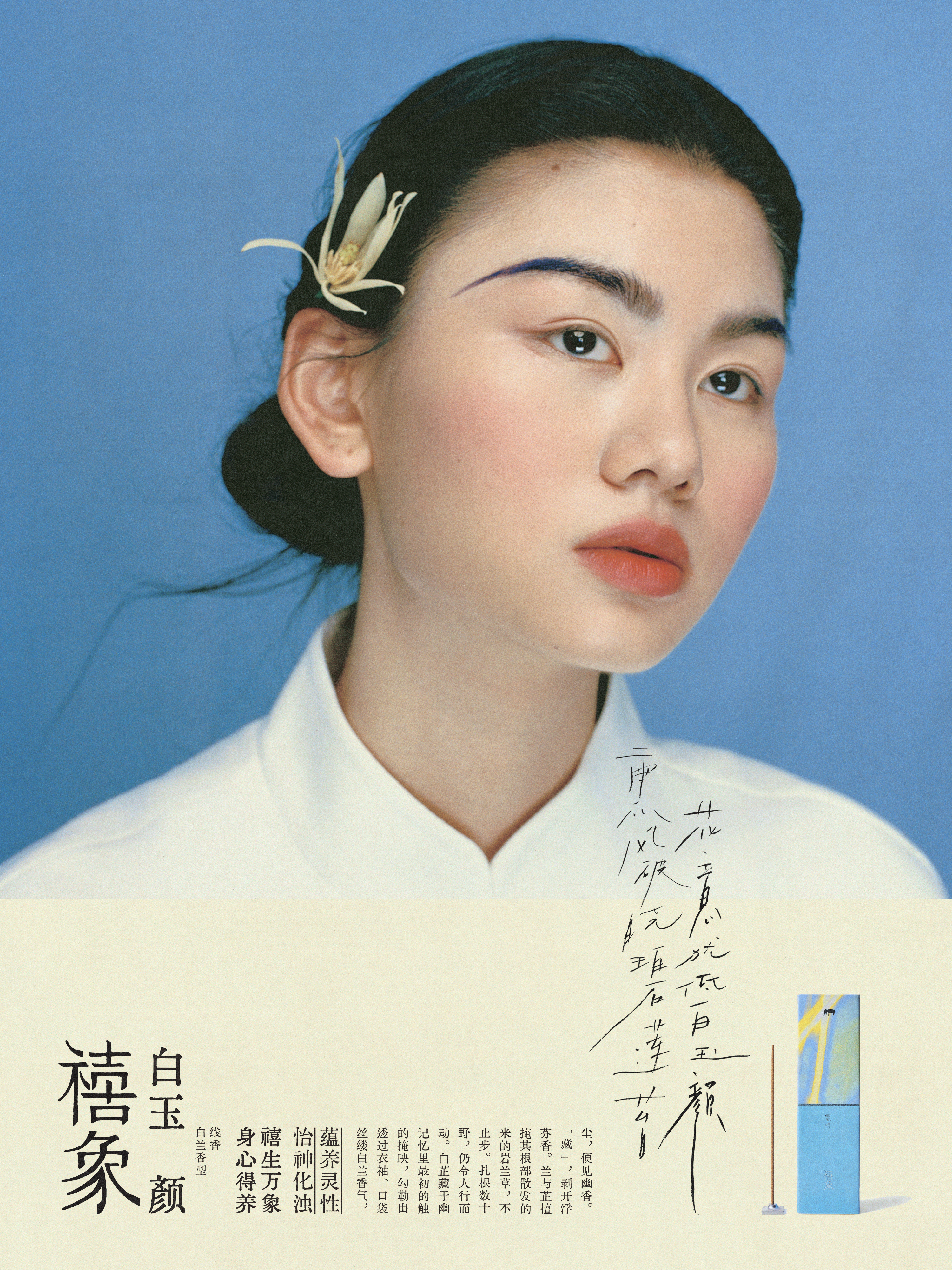
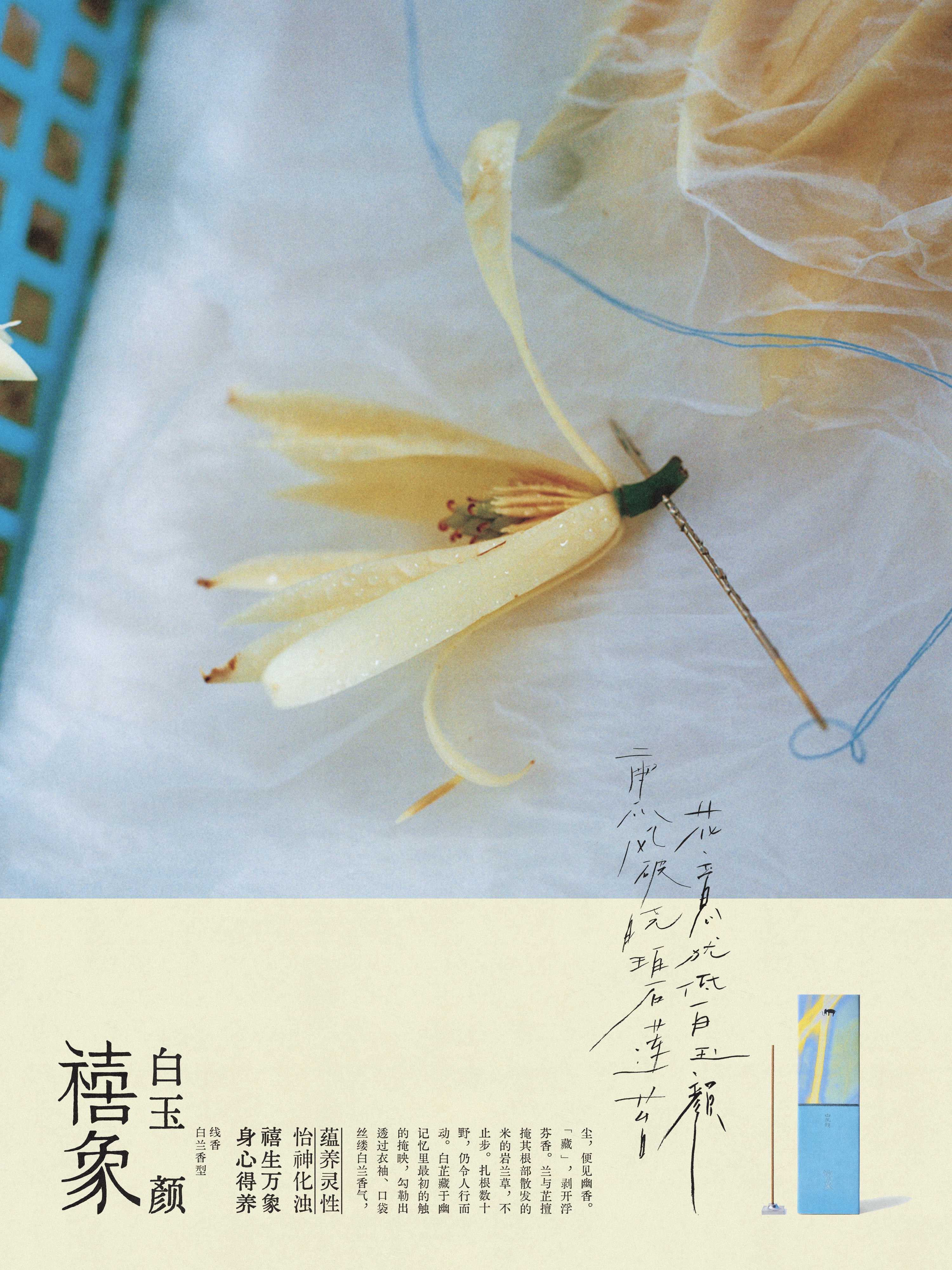
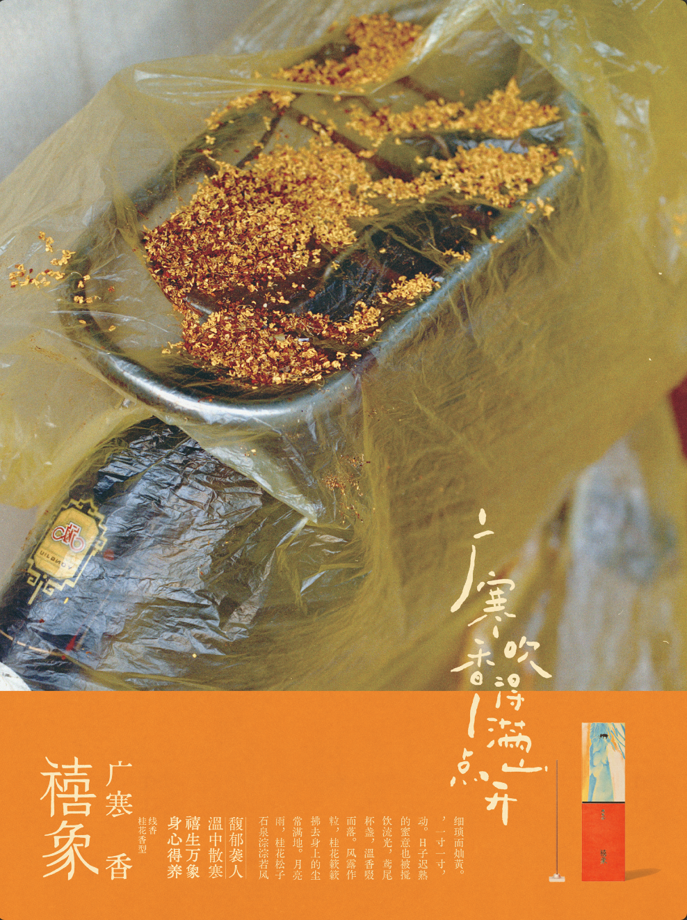
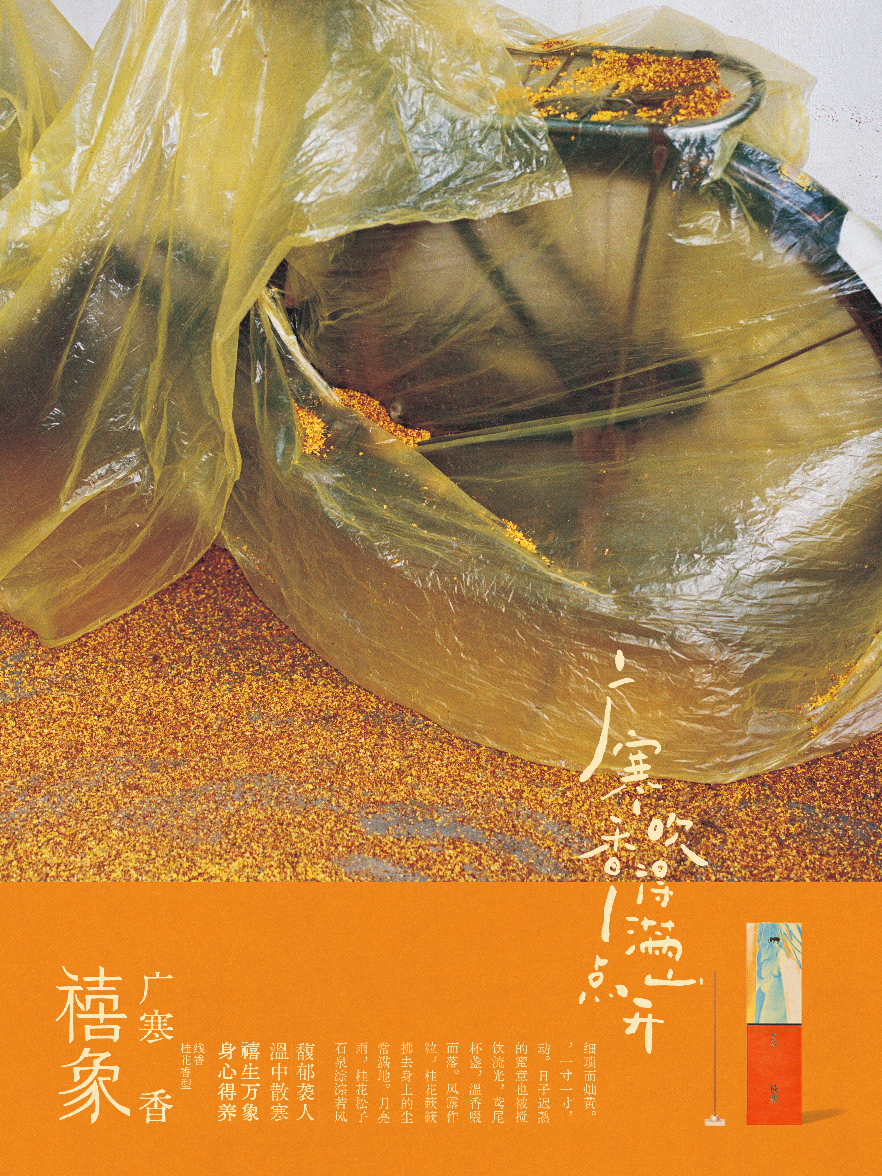
XI XIANG 禧象
Summer 2024
Packaging, Brand design
Group work
Packaging, Brand design
Group work
We upgraded the brand identity for the Chinese lifestyle brand,禧象 XI XIANG, as well as designed the new packaging for the releasing of ‘Four seasons blossom’ series products. This project is a journey for the tradtional culture and conceptual art, we brought the nature into the packaging, and traced the traditional concept behind the brand’s names as well as its concept: to bring the wisdom of Chinese medicine and incense to modern society.
LOGO
The brand name XI Xiang ,could translate to ‘fortunate elephant’ in English. In traditional Chinese culture, the elephant is a symbol of strength and wisdom. The sigificance of elephant could be dated back to Shang dynasty.
We redesign the icon of XI XIANG bases on the traditional figure in ancient times, and simplified its lines to make it more modern-like.
We want this icon to bring a old, calm feeling to its customers.
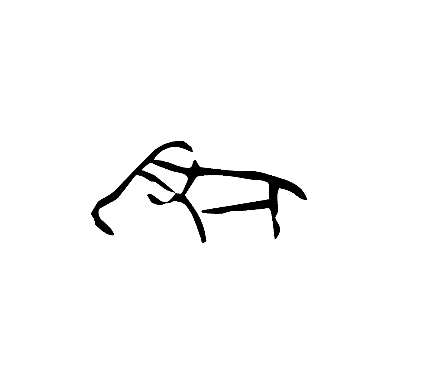
( Above: Evolution of the icon from ancient to modern )
FONT
We also designed the font for XI XIANG’s slogan. In attempt to bring an ancient feeling, we made the font to have a seal-engraving feeling and clean lines.
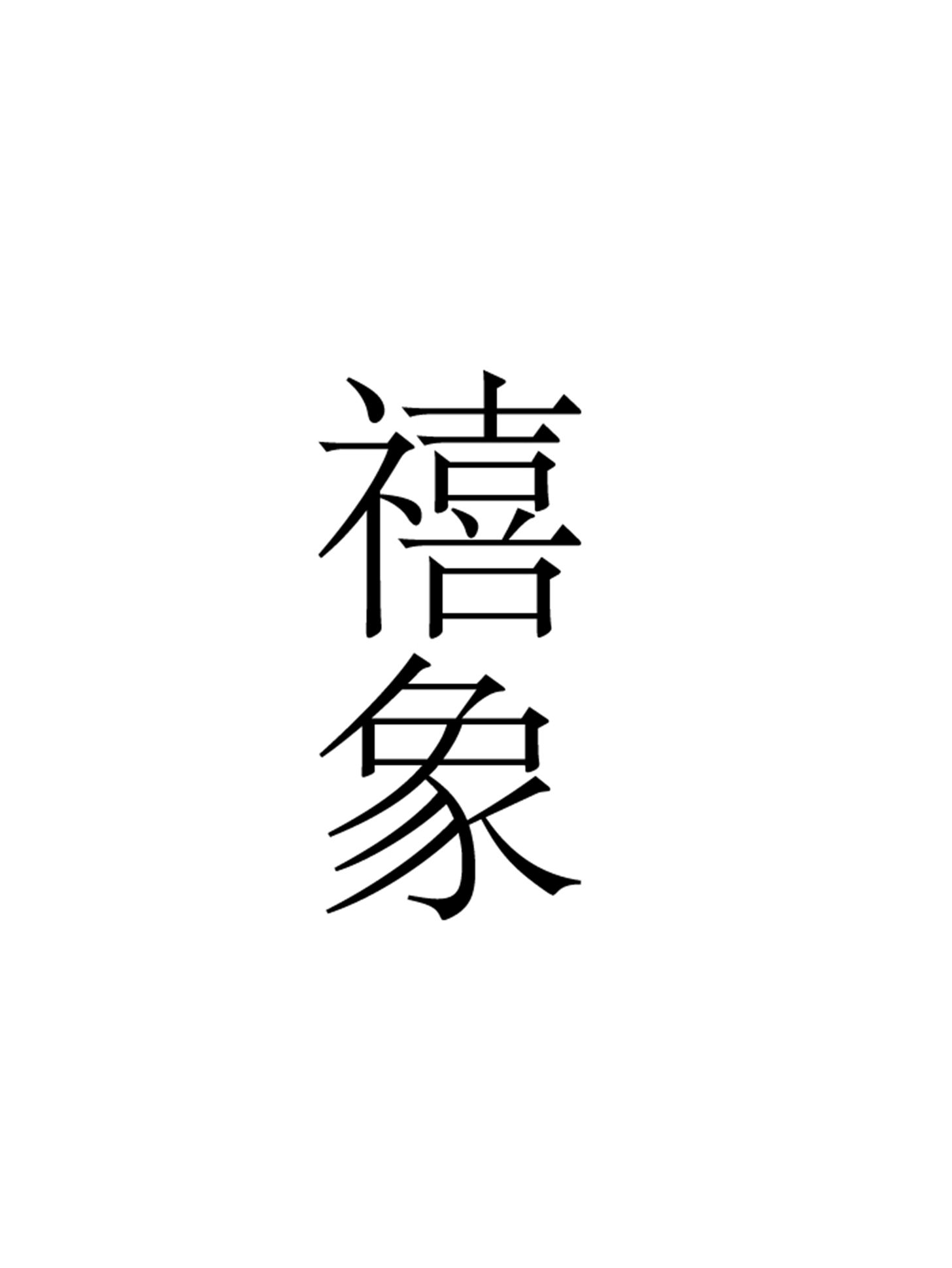
( Above: Evolution of the font )
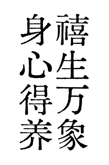
BRAND SLOGAN
Body and mind nurture, bringing forth all aspects of life.
身心得养 禧生万象
PACKAGING
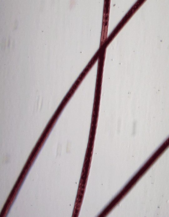
The packaging for the new series ‘Four seasons blossom’ connects the nature to the plants. Each season has its unique plant, as we want to let the customer feel the smell of such plants visually, we use microtelescope to capture the original lines of plants, traced the appearances, transfromed their shapes into gradient color and abstact forms to represent to the concept: the incense’s shapeless.
Unfolding the packaging
Layout for Instructions
Poster Series


Packages